Beyond Delights, a sex-wellness brand, was just opening their ecommerce platform in 2017.
They visualized something gold+black&white and something featuring dildo.
To get inspired I played Serge’s Gainsbourg and Jane Birkin’s song – Je t’aime, and dived into their (much-ahead-of-their-time) open and sensual romance, full of beauty, pleasure, children and brilliant, really brilliant people. Who delights better then french, right? 😉 I knew we need a bit of it.
Aaand, something else…
Pamela Anderson?
Nay..
Something a bit less open, since some people find it offensive. Something that’s hidden beneath the curtain and smoke. Barely loomed under the candle lights…
That took me to a 1001 nighs’ harem, with sables and belly-dance, perfumes and sweat and clank of golden ornaments, where everything is allowed, behind a cutain and a stone wall, and armed guards, and a crocodile pit… And I thought they need a bit of that, too!
And now, since I ended up tangled in seductive swirls and luscious swashes, I had to clean it up a bit (we are living in a modern world after all! ) and give it a clean and minimal look.
So here we have a logo! Check it out:

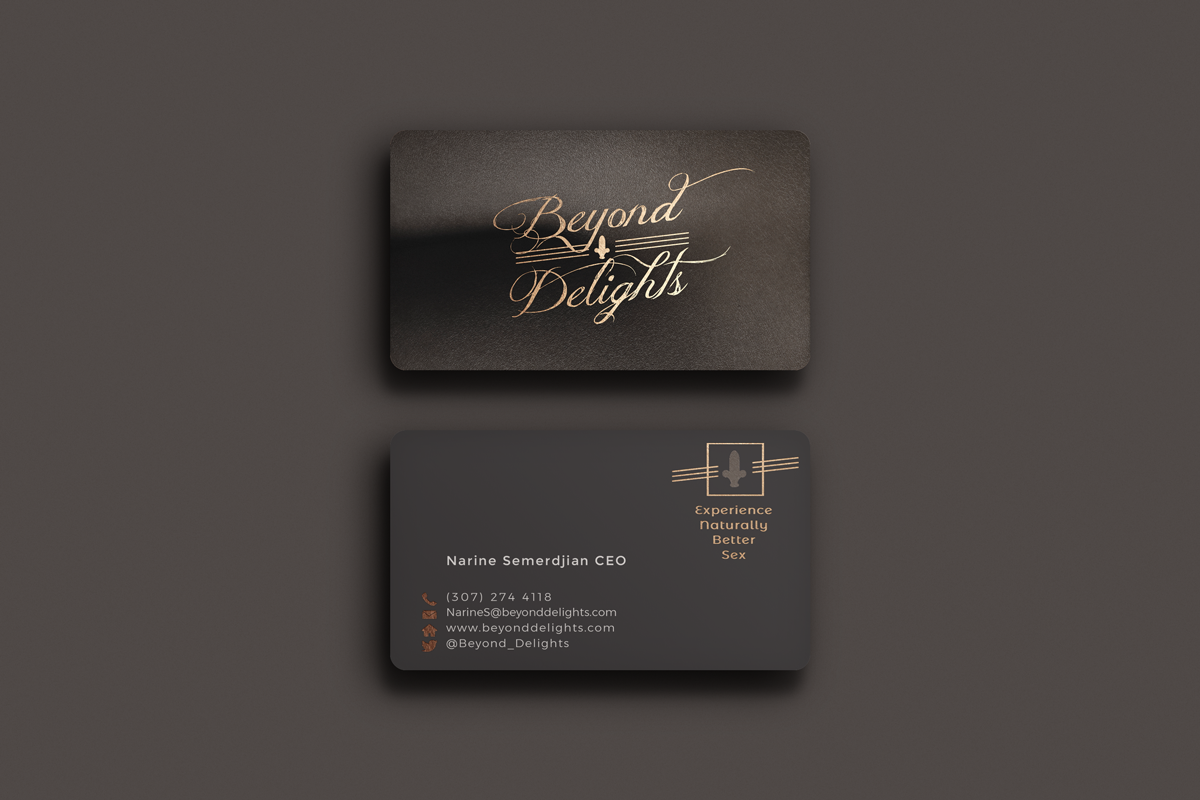
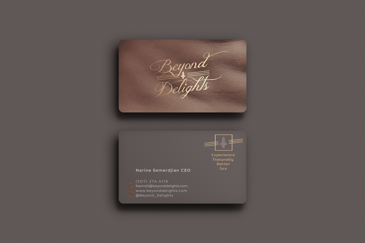
Then the next part of the Beyond Delights branding. The idea was to make a very sensual, touchable business cards, with a soft touch finish, that you just want to keep in your hands end evoke senses, like caressing skin, even more with the gold foil logo over it.
Cards also featured closeups of different human skins (since Beyond Delight supports diversity).


Go back to Portfolio.

The story of how a Fleur-de-Lis became a cactus. The lack of complexity in execution is redeemed with multi-layered concept.
LikeLike
Lol Marko! We internally call it spildo (spear+dildo) 🙂
Thanks for your comment!
LikeLike